Saturday, 31 March 2012
MORE FEEDBACK
Friday, 30 March 2012
FEEDBACK ON MY MAGAZINE

I would definitely use Facebook or Twitter to help distribute my magazine as they are both such huge sites which appeal to a vast variety of audiences - this may help to expand my target audience. Facebook also use advertisements to pay for their site therefore I could also advertise my magazine via this - YouTube also use the same format so either of these sites would be extremely useful.
Thursday, 29 March 2012

Wednesday, 28 March 2012

.jpg)
Monday, 26 March 2012
Sunday, 25 March 2012
Friday, 16 March 2012
EDITING IMAGES


The picture on the left shows the original image i took with my camera. It took a while to get the picture how i wanted, in the fact that i had to get the models to jump at the same time whilst i was trying to capture the jumping motion. To edit this picture, shown to the right, so i could use it on my magazine i used fireworks. I used the magic tool so i could select the background to delete. This was quite difficult as i was unable to select it all so i had to go around with the rubber tool to delete any unwanted areas. I think the overall outcome has come out good considering it was quite a tricky procedure. On the final magazine i have changed the brightness and contrast of the picture to make it stand out more and look more bold and effective.


Again like the picture above i have used Fireworks and the magic tool to get rid of the background. I have chosen to get rid of the background as the picture was taken in a sports department reception therefore the situation wasn't very relevant to music so i decided to take it out and just put the picture on the right on. I have also added brightness and contrast to the picture to try to make it look more professionally taken.
Wednesday, 14 March 2012
COLOURS

Above shows some colour schemes i have put together for ideas for my magazine. Again like the title the colour scheme has to appeal to the target audience and be bold, so that people are able to remember the magazine when it is distributed. When they are in block colours as i have presented them, i am able to see what colours work well together and which contrast with each  other. When i input these to my magazine, some that i thought would work well together infact didn’t and vice versa. Therefore in the end i decides to go with the first block of colours. These colours are shown to the right.
 other. When i input these to my magazine, some that i thought would work well together infact didn’t and vice versa. Therefore in the end i decides to go with the first block of colours. These colours are shown to the right.
 FONTS


Monday, 12 March 2012
Some of the photographs I have taken.

 Both of these two shot photographs I have taken to go on the front cover of my magazine. Unfortunatly, the left hand image, the timing was not great as I didn't take the picture at the right time. I wanted the pictutre to be of them both jumping in the air. I had to take a few shots of this image until I found the best one to use. The image to the right was the first time i shot a picture like this. The timing was good however the image itself was too dark and the background was too complicated to crop out therefore I changed where i was taking the image.
 Both of these images were taken to be used either on the contents page or the double page spread, as it of the main cover story artist. I have tried to use the input of guitars to make it look more relevant to the music industry. I think the image on the right is a much more successful image as the left hand image looks a bit awkward and forced, it doesn't look like a natural pose. Again like all other photographs, I had to take quite a few images to try and get the best one.

These images were taken purely as I needed to fill in some space on the contents page. I decided to use the idea of a 'new DJ' or 'Home studio'. I took these images on the plain wall background so that if i wanted to crop the image out it would be much easier to do so. I don't think either image is awful but i think the image on the right is better as it is a close up and is more focused on the keyboard whereas the other image, his eyes are not focusing on anything within the image itself.


These 3 images above have been taken to look like the girl is at a festival. I asked her to wear shorts, summery top, sunglasses and festival neckband as it would then hopefully portray as if she was at a festival. With this image I will definitely be cropping the background out so it didn't as much matter what it was but I wanted to get a picture outside so that we could have the natural sunlight. I think out of all 3 the most successful is the mid shot(furthest left) as it looks much natural and less posed. The middle image is too zoomed in and therefore you are unable to see the aim of the photograph, in contrast the far right image is too zoomed out and me loose the detail of the image.
Saturday, 10 March 2012
UPDATE
Although on my plan I said I was going to decide on my colour schemes and main stories before I had to take the pictures - I decided to change this around. As I knew my images would take a lot of editing, as I had to take out the backgrounds, I thought it would be best to take the images as soon as possible. I had a brief idea in my head about the stories but I knew the main image had to be of an artist so I then found my two models to do this. I then later decided on my other smaller stories so was able to crack on with the rest of the photographs.
Friday, 9 March 2012
Drawn plans of my magazine.
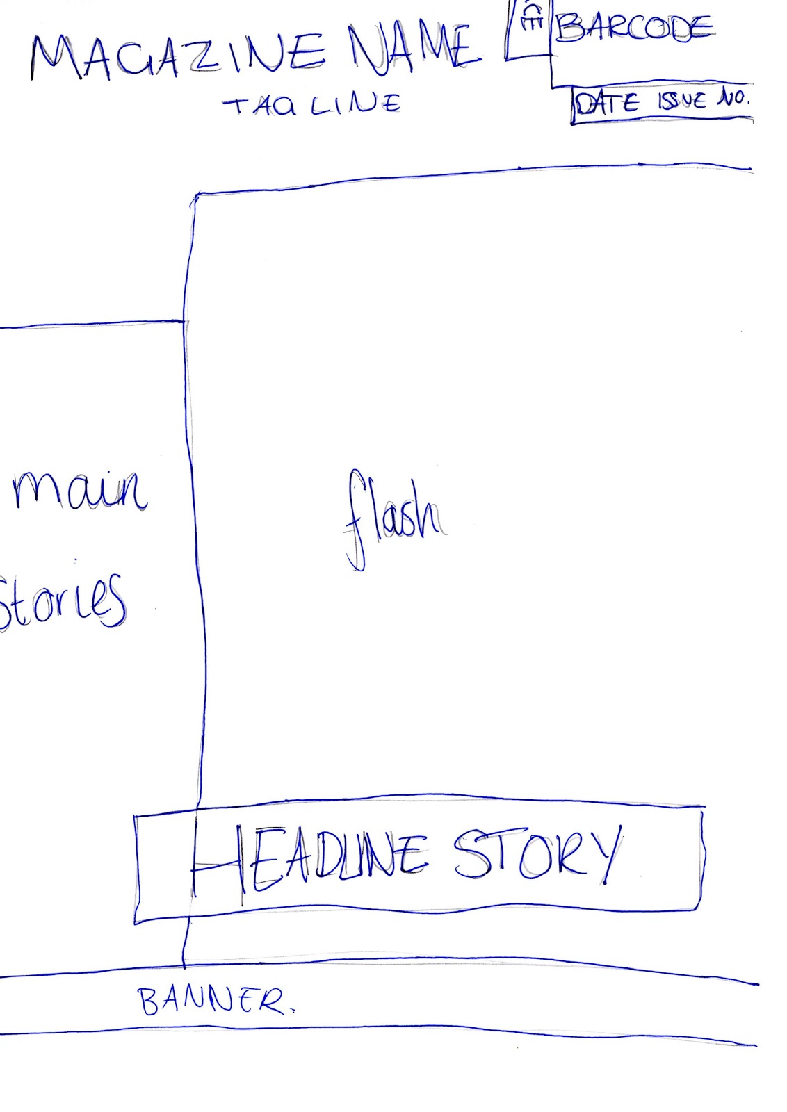 This is my magazine front cover plan that I have drawn and scanned onto the computer. I will use this to help direct me when I am designing the final piece. This is will useful as I will not be thinking of ideas from my head, I can use this as a brief idea.
This is the plan for my contents page. After my research I thought I would try to lay it out in the style of NME or Q as I thought they looked very sophisticated and clear looking. Again I drew this out by hand and scanned in onto the computer.

Finally this is my double page spread plan. I wanted to do an interview style page as again looking through my research many magazine have interviews with music artists about their career.
Thursday, 8 March 2012
Plan for my main task
1. Research music magazines
2. Brief plan of the front page, contents page and double page spread.
3. Decide on a colour scheme.
4. Design my title.
5. Create main story lines which can determine what pictures need to be taken.
6. Take the photpgraphs which I could use for my magaizne.
7. Start putting main stories and pictures into the magazine.
Monday, 5 March 2012
Results From Music Questionnaire.
From the 20 magazine questionnaires that I gave out to people to complete, i have made 3 pie charts to show you some of the results and a small analysis of them.

 From this chart we can see that 1/4 of all the people I surveyed do not buy a music magazine at all. However in my opinion, I would much rather buy a celebrity magazine with all the gossip a music magazine would have in it anyway. The biggest category is the 'one a month' therefore this is where I have got the idea to release a music magazine every month.
This pie chart shows that the most popular category of prices for a magazine is £1.50 - £1.99. I think this is a reasonable price for a magazine, it is what most magazines are prices at. The category £3+ no-one said that they were prepared to pay as much as that. From this information i had decided to price my magazine at £1.99.
Sunday, 4 March 2012
Music Magazine Questionnaire
Please circle the appropriate
---------------------------------------------------
What gender are you?
Female Male
---------------------------------------------------
What age category do you fall into?
16 & below 17-24 25-32 33-40 41-48 49-56 57+
---------------------------------------------------
What music are you interested in?
Pop Classical Rock Dance Country
R&B Indie HipHop Other: Please State______________________
---------------------------------------------------
Do you read music magazines?
Pop Classical Rock Dance Country
R&B Indie HipHop Other: Please State______________________
---------------------------------------------------
Do you read music magazines?
Yes No
---------------------------------------------------
How often do you purchase a music magazine?Everyday
Once a week
Twice a month
Once a month
Once a year
Never
---------------------------------------------------
How much would you spend on a music magazine?
0.99p and below £1 - £1.49 £1.50 - £1.99 £2 - £2.49 £2.50 - £2.99 £3+
0.99p and below £1 - £1.49 £1.50 - £1.99 £2 - £2.49 £2.50 - £2.99 £3+
---------------------------------------------------
If you read a preferred music magazine, please state the magazine.
________________________________________________________
If you read a preferred music magazine, please state the magazine.
________________________________________________________
---------------------------------------------------
My Evaluation of my Preliminary Task
Throughout the producing of my front cover and contents page of my school magazine there were several aspects which I found either easy or difficult. From the very first stages I had quite a clear image in my head as to what I wanted my magazine to look like, through inspiration of researching magazines, therefore I found this quite easy. I also found the choosing of my colour scheme quite easy to do as I tied it into the school logo colours of green and white. The front cover is bold and attractive with contrasting colours to make certain texts and areas stand out more than others. I found it much harder to pick a layout for my contents page and I wished I had researched more into these before I had started the preliminary task. Therefore my contents page isn’t as successful as I had wished it to be.
I found choosing and taking the images for my magazine quite tricky. I didn’t know how to take the main image, how it should be presented so for my main task I will look into camera angles and shots in much more detail so I can represent the image exactly how I wish to. I will also organise my time better and stick to the plan I make. Through this task I haven’t done things in the order they should be done so it has made things quite difficult, and I was improvising a lot without plans and templates.
If I was to research specially into school magazines I would have found the task much easier in the fact I would have known how they were layout out and what types of images and the types of information to go into the magazine. I would say my front cover is much more like a celebrity or music magazine than I school magazine.
To attract the audience to my magazine I tried to use contrasting colours so that the text stands out from the background. The main image on the front immediately attracts you to the page as it is central. I have used the left hand side of the page to write the main stories within the magazine which is the rule of the left 3rd. I have also used images to try and intrigue the audience as it will look more appealing. I used a skyline at the top of the page which could appeal to the audience and grab their attention from the start.
The only programs I have used whilst to produce my magazine are Publisher and Fireworks, therefore I haven’t really learnt much about the software I used. For my main task I will aim to use a much wider variety of programs and software to get the best potential. I will edit my photographs so they can be of a better quality and become much clearer.
I am pleased with the outcome of the task, as it was the first attempt so I am able to learn from this. The think the front cover of my magazine is much more successful that the contents page; I did spend longer on the front cover. However I don't think the front cover resembles a school magazine, just a magazine in general.
Overall for my main task, I will plan my time much more carefully and organise when to take my photographs and whom I shall be taking them off and doing what. This then gives me the advantage to know who I am to aim my audience at, which helps me to choose the colours and style of the magazine. I shall research a lot more into music magazines so then I have a clear image in my head as to what my magazine should include.
Subscribe to:
Comments (Atom)